GothicSigilCursorGothicSigilCursor Cursors

  • Published on August 16th 2026 under the Attribution Required (CC by) license.
5 out of 5 stars. (2 reviews) Log-in to add your review.

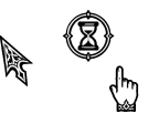
Gothic Sigil Cursor is a stark, high-contrast theme that abandons color for pure form. Each icon is meticulously crafted to resemble a carved stone relief or a sacred geometric diagram. Perfect for those who appreciate order, sharp aesthetics, and a touch of arcane mystery.

🏛️ Sacred Geometry — Features intricate tessellations, tridents, and gothic arches.
🎨 Monochrome Mastery — Stark black-on-white design ensures maximum visibility and a clean UI.
🖱️ Plug & Play — Standard .cur / .ani formats, no extra software required.
🎯 Dual-Purpose Icons — Carefully designed to be legible at both tiny (32px) and large (48px+) sizes.

Resources

See also

Miss Pink Elf (Elysia) Honkai Impact 3rd TeaserMiss Pink Elf (Elysia) Honkai Impact 3rd Cursors
by kanadeyoisakix601i hope u enjoy ❤ *★,°*:.☆( ̄▽ ̄)/$:*.°★* 。
Sua | alien stage/ALNST TeaserSua | alien stage/ALNST Cursors
by Cordelia135Sorry this took a while I haven't been posting much online as of late
Window (SYMBOLS ONLY) TeaserWindow (SYMBOLS ONLY) Cursors
by yes62this is related to my other set (Window) but this one only has the sy...
Blue Deltarune TeaserBlue Deltarune Cursors
by Arcangelise13by @vev13417 on twitter
ColoredPointers TeaserColoredPointers Cursors
by -_-207So today, I want to share with you a cursor set. That I made in the p...

speech bubble iconTop reviews

user icon
user iconIlove676767676767 about 20 hours ago 1

How is it ai?

I have answered your question in the comments below. - by Yoko about 17 hours ago
Because if I were to describe it myself, it would probably be: a Gothic-style mouse pointer. - by Yoko about 17 hours ago
user iconugh about 22 hours ago 1

ai gen slop

I agree, because this pointer looks good in the original image, but it's not suitable for use. - by Yoko about 17 hours ago
There are many problems, such as: the high resolution requires an extremely high magnification to function properly. - by Yoko about 17 hours ago
Insufficient vectorization and uncool animation effects - by Yoko about 17 hours ago
user iconITotallyEatCrayons on August 17th 0

5 out of 5 stars.

its cool! it's such high quality! i'd love to see more soon!
just, not bei ng rude but the desc looks like AI so 😅

描述就是AI - by Yoko about 18 hours ago
My input method caused me to comment twice. - by Yoko about 17 hours ago
What I mean is, the description is indeed generated by AI. - by Yoko about 17 hours ago
Because if I were to describe it myself, it would probably be: a Gothic-style mouse pointer. - by Yoko about 17 hours ago
I'm a boring person, and I don't like writing instructions for the things I create. - by Yoko about 17 hours ago
But it's obvious that this is because I'm very familiar with the work. - by Yoko about 17 hours ago
However, it might be too rudimentary for others. - by Yoko about 17 hours ago
That's why I used this method. - by Yoko about 17 hours ago
I don't have any particular likes or dislikes towards AI, because it's just a tool. - by Yoko about 17 hours ago
Ultimately, everything hinges on the final result. - by Yoko about 17 hours ago
user iconrandom on August 16th 0

5 out of 5 stars.

This looks great I like the busy animation and alternate select cursor a lot, it really does look like stone.